A great badge does two jobs at once: it identifies the wearer and it moves the event along. Custom event badges that are laid out well are readable across a room, survive being flipped backward, and carry the access info staff need. This guide covers double-sided printing and the layout choices that make custom event badges work.
The single most common badge mistake is a name too small to read at conversational distance. Fix that and most other problems shrink.
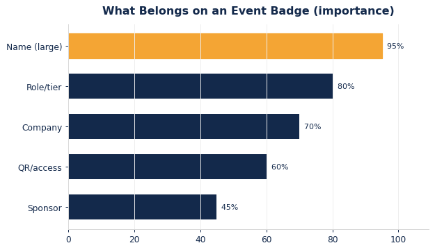
Prioritize the name, then role or tier, then company. Access elements like a QR code or color band come next, with sponsor logos last. The importance ranking below is a reliable starting hierarchy.
Set the first name in the largest type on the badge — big enough to read from six feet. Everything else supports it.
Badges flip. A double-sided print means the wearer is identified even when the badge spins backward, which happens constantly on lanyards. It also doubles your usable space: put the name and role on both sides, or reserve the back for a schedule, map, or Wi-Fi code.
Use color bands or icons to signal access tiers so staff can verify at a glance. Keep the design system consistent across tiers — same layout, different accent — so the badges read as one family while still distinguishing VIP, staff, and general admission.
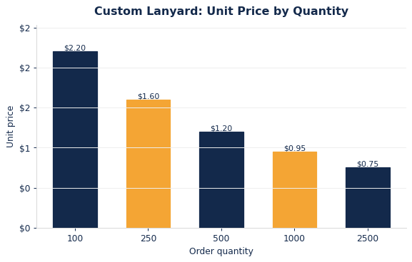
Badges and lanyards both get cheaper per unit with volume. The curve below shows typical lanyard pricing by quantity, useful when bundling badges and lanyards for a full credential package.
| Element | Placement | Why |
|---|---|---|
| Name | Top, largest | Read across a room |
| Tier | Color band | Fast staff check |
| QR/access | Corner | Scan without clutter |
| Map/Wi-Fi | Back side | Pocket program |
Choosing the lanyard to pair with it? See our companion guide, our Lanyard Materials Compared: Polyester, Nylon, Bamboo & Recycled. Browse our custom credentials & lanyards or get in touch to start.
Modern events lean on badges to do more than identify people; they power check-in, access, and networking. Building a QR code or barcode into the layout lets staff scan attendees for session tracking, lead capture, and re-entry without manual lookups, and it lets attendees self-serve by scanning each other to exchange contact details. Place the code where it is easy to scan — a lower corner or the back — and keep a quiet zone of white space around it so scanners read it reliably on the first try.
If your badges drive access control, encode tier information consistently so a quick scan or a glance at a color band tells staff what a credential unlocks. The layout should make the human-readable and machine-readable elements agree, so a VIP badge both looks like a VIP badge and scans as one. Getting this right removes friction at every door and data touchpoint across the event.
A badge’s physical build affects how it reads and how long it survives a multi-day event. Standard badge sizes balance readability against bulk; too small and the name cannot be read across a room, too large and it flips and flaps on the lanyard. Cardstock inserts in a rigid or vinyl holder are economical and swappable, while printed plastic cards feel premium and last. For events with sun, rain, or rough handling, a laminate or water-resistant stock keeps the badge legible to the end.
Pair the badge with the right lanyard and attachment so it hangs at a readable height and orientation. A badge that spins backward defeats a single-sided print, which is exactly why double-sided printing and a good attachment matter. Deciding size, stock, and hardware together yields a credential that stays readable and intact through the whole event.
The best badge design also fits your on-site workflow. Pre-printing badges by name speeds check-in but requires an accurate registration list, so plan a small on-demand printing setup for walk-ups, corrections, and reprints. A layout that a desktop printer can reproduce cleanly — with the name field positioned consistently — makes those on-site reprints painless. For access tiers, keeping the base layout identical and varying only a color band or icon lets you print all tiers from one template.
Order blank stock and holders with a comfortable overage for walk-ups and replacements, and keep a few pre-assembled spares of each tier ready at the desk. This preparation turns the inevitable last-minute changes into a non-event and keeps the registration line moving even at peak arrival.
A well-designed badge is a networking and sponsorship tool, not just an ID. Adding a scannable code lets attendees exchange contact details with a tap and gives sponsors a clean way to capture leads at their booths, turning every credential into a small data engine. Reserving a defined area for a sponsor logo — clearly secondary to the attendee’s own information — creates real value you can sell without cluttering the badge or confusing its primary job of identifying the wearer.
Thoughtful layout keeps these competing needs in balance. The attendee’s name and role stay dominant so the badge works as identification first, while codes and sponsor marks occupy consistent, secondary zones. When you sell sponsorship on the badge, showing prospects a mockup with their logo in that reserved area makes the value tangible and keeps the design disciplined, so the badge serves attendees, staff, and sponsors at once.
Badges flip constantly on lanyards, so a double-sided print keeps the wearer identified even when the badge spins backward. It also doubles usable space, letting you add a schedule, map, or Wi-Fi code to the back.
Lead with the first name in the largest type so it reads across a room, then role or tier, then company. Access elements like a QR code and a color band come next, with sponsor logos last so they do not crowd the essentials.
A consistent color band or icon lets staff verify access at a glance without reading fine print, speeding up every door. Keeping one layout across tiers and varying only the accent makes the badges read as one family while still distinguishing them.
Pre-printing by name speeds check-in when your registration list is accurate, but always keep an on-demand setup for walk-ups, corrections, and reprints. A consistent layout that a desktop printer reproduces cleanly makes on-site printing quick, and keeping a few pre-assembled spares of each tier at the desk means last-minute changes never hold up the line.
We’ll lay out double-sided badges and match them to the right lanyard and attachment.